


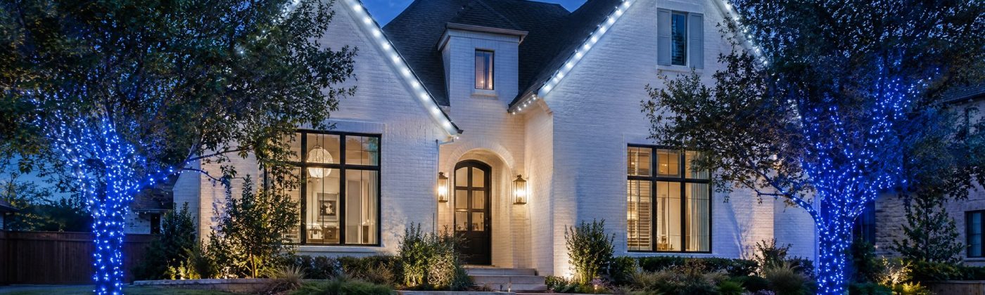
Blue and white Christmas lights look best when each color has its own job: white draws the house, and blue goes on one tree, one bed of shrubs or one repeated accent. Choose a single white for everything before you buy any blue, and judge the balance after full dark, because blue looks stronger once your eyes adjust to the dark.
That’s the whole theory. The rest of this page is how it plays out on real Austin houses: which white suits a cream limestone front versus red brick, seven layouts with what each one needs, the bulb math for an alternating roofline, and a ten-minute test that saves you from ordering 300 feet of the wrong blue.
Give blue one job
The most common blue-and-white display that doesn’t work looks like this: a white roofline, then blue scattered everywhere else in roughly equal amounts. A blue shrub here, a blue post wrap there, a blue string on the railing, a blue mini tree by the mailbox. From the street it reads as two colors fighting, and nothing looks intentional.
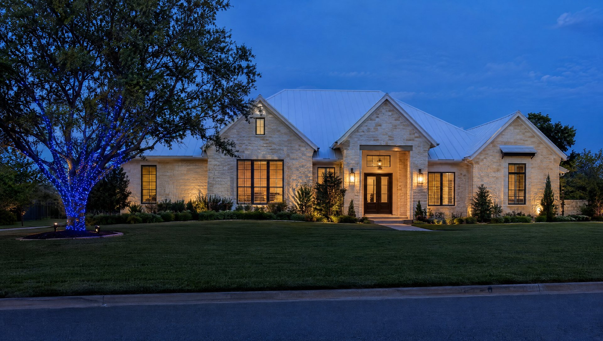
Fix it by deciding where blue lives. One tree. One bed. One repeating pattern on the roofline. The white then has an obvious role too: frame, background or partner. The reverse works as well. A mostly blue house with one warm-white doorway is striking because the door becomes the only warm thing in a cold scene.
And leave some surfaces dark. Unlit wall and lawn between features give the colors edges. A front elevation lit edge to edge in two colors becomes one bright blur.
Pick the white before you buy any blue
There is more than one white, and the choice changes what the blue looks like:
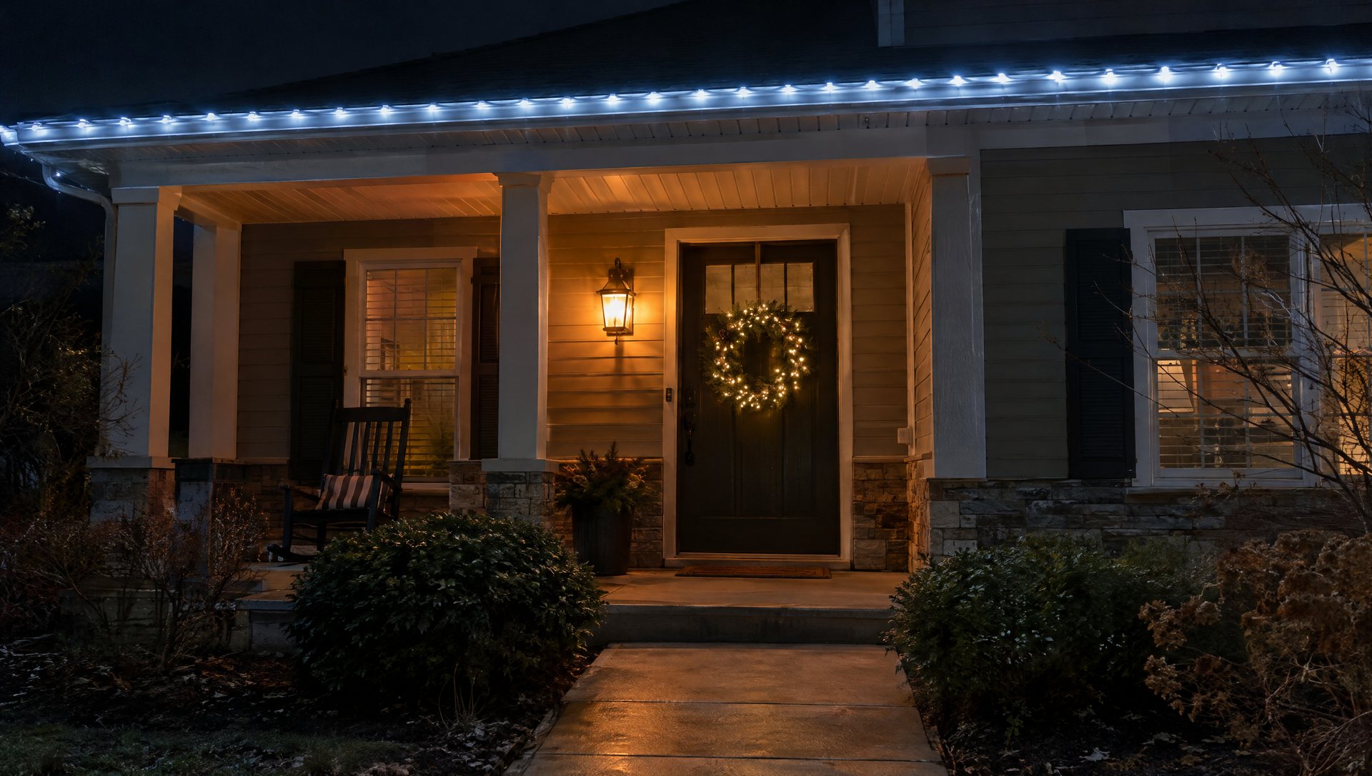
Warm white usually around 2700 to 3000K
- On its own
- Glows golden.
- Next to blue
- Feels soft and close to the color of the windows.
Pure or bright white around 4000 to 5000K
- On its own
- Neutral.
- Next to blue
- Keeps the blue crisp without turning the house cold.
Cool white often 5000K and up
- On its own
- Already leans slightly blue.
- Next to blue
- Makes the icy, winter-movie look.
All three can work. What doesn’t work is having two or three of them on one house by accident, and it almost always happens the same way. Someone buys a cool-white roofline because it looks right with the blue. The pre-lit wreath on the door is warm white. The porch lanterns already have 2700K bulbs in them. Now the entry glows dingy yellow under a bluish roof, and the blue tree is the only part that looks deliberate.
Four ways to avoid it:
- Choose the white first and buy the wreath, garland and every string to match it.
- Go warm if the house already is. If your porch fixtures, landscape lights and window glow are all warm, a warm-white roofline with a blue tree is much easier than fighting them.
- Swap the porch bulbs for the season. Two lantern bulbs that match a cool-white display cost far less than re-buying a roofline.
- Keep unlike whites apart. If you must mix, put them in separate zones, never on the same run or the same doorway.
If you’re still deciding between colors and white at all, our colored versus white lights guide takes that question on directly.
Read the facade: limestone, brick, white paint, stucco
The wall behind the lights is half the design. Use a daytime photo of the front of the house to choose the layout, then a night test to judge the color.
Cream or tan limestone. The classic Hill Country front is warm-toned, and it changes the whites. Cool white bulbs against cream stone can look gray and slightly dirty, while warm or pure white looks like it belongs. Blue reads strongly against pale stone. On a limestone house, a pure-white or warm-white roofline with blue in the landscape is the safest bet.
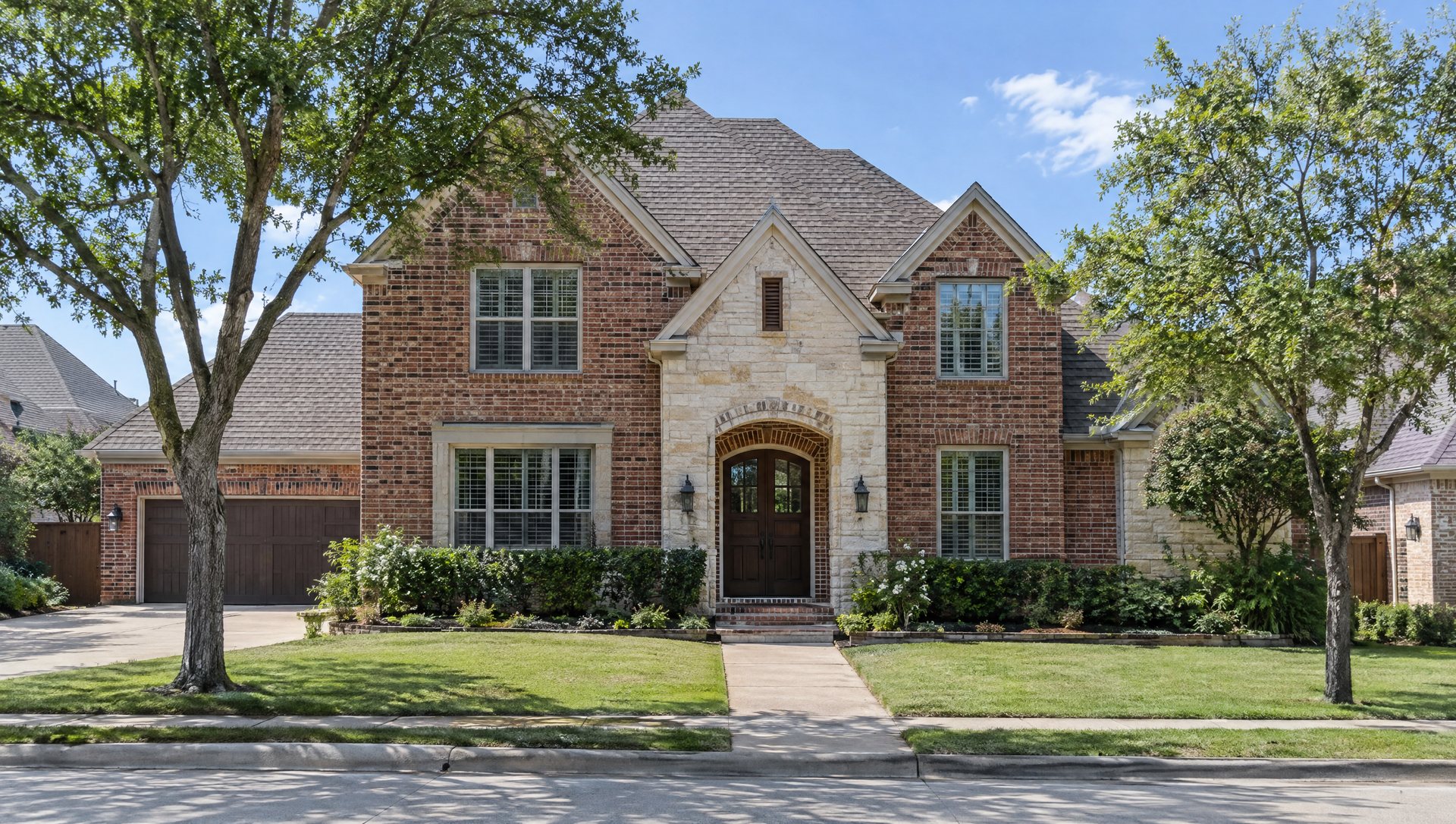
Red or orange brick. Brick reflects very little blue light. Blue bulbs seen directly still pop, but anything that relies on blue washing the brick, like an uplight or a projector, looks murky and purple-dark. Keep blue on the trees and shrubs in front of brick, and let white carry the walls and roofline.
White-painted brick and light siding. The modern-farmhouse white you see all over new Austin builds is the easiest background for blue and white. Almost any layout works. The risk is the opposite: too much blue reflecting off a white wall can turn the whole front a cold, even blue. Use less than you think.
Dark paint and board-and-batten. Dark facades swallow color. Here a crisp physical outline in white matters more than a lot of blue. Blue on a dark house works best as concentrated points, like a wrapped tree in front of the wall rather than lights on it.
Stucco and tile roofs. Stucco takes light beautifully, so the same rules as white paint apply. Tile roofs need different clips than shingles, and some tile edges don’t take a roofline cleanly at all, which is a good reason to put more of the design into trees and beds.
Seven blue-and-white looks for Austin houses
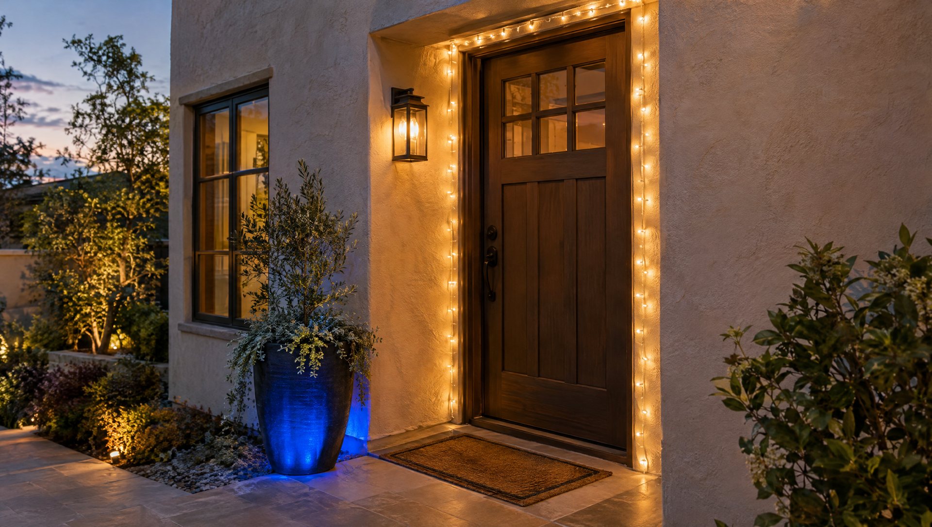
1. White house, blue tree
Keep the roofline white and put all the blue into one prominent tree. It’s the easiest layout to get right and the hardest to get wrong. It works best when the tree has a recognizable trunk and branch shape, like a live oak or a multi-trunk crape myrtle, so the wrap draws the silhouette. Wrap the trunk and main limbs at least; for the showstopper version, a full canopy wrap carries the blue out through the whole tree. Pick another layout if your best tree is far off to one side and the house would look lopsided; pick a closer tree or add a matching blue element on the other side.
2. Warm doorway, blue garden
Blue on a group of shrubs or one ground-level bed, warm white around the door and porch. The entry stays welcoming while the garden carries the winter color. This is the right answer on a house whose porch fixtures are already warm. Keep the blue even across the shrubs, so one bush doesn’t glow brighter than its neighbors. Our shrub lighting guide compares net lights with hand-wrapping for exactly that.
3. The alternating roofline
Blue and white bulbs alternating along the roofline: graphic, a little retro, and very readable from the street. It’s the most technical of the seven, so it gets its own section below. Pick another layout if the roofline is a maze of short runs and corners; the pattern needs long straight lines to read.
4. White icicle edge, blue trunks
A white icicle line along one long, accessible eave, with quiet blue trunk wraps below. The detail lives at the top and the simple shapes at the bottom. Keep the icicle drops regular and the blue restrained. Our icicle lights guide covers how to hang them straight and where they look best. Pick another layout if the roof edge is two stories up or broken by gables; a clean straight roofline is better than a ragged icicle line.
5. The winter courtyard
White at the entry, blue deeper in, in a side courtyard, behind a low limestone wall or along a back fence visible from the street. The difference in depth creates a layered view instead of a flat row of lights at the curb. Keep the actual path to the door normally lit. The blue is something for the eye to travel to, not the light you walk by.
6. Almost all white
An overwhelmingly white display with one small blue surprise: a planter, a short run by the entrance, a single wrapped crape myrtle. The color becomes something people notice on the second look. This is the right starting point for a household that likes blue but isn’t sure about committing the whole house to it, and it’s easy to add more next year.
7. Almost all blue
The reverse: blue trees, blue beds, maybe a blue roofline, with the white saved for one thing, usually the front door or a single tree by the entry. It’s bold and very wintry. It needs a light facade (white paint, pale stone, stucco) to work; on dark brick an all-blue house disappears into the night.
The alternating roofline, worked out
Alternating blue and white C9 bulbs is the look people ask about most, and the one most often installed so it looks slightly off. The difference is in the bulb count.
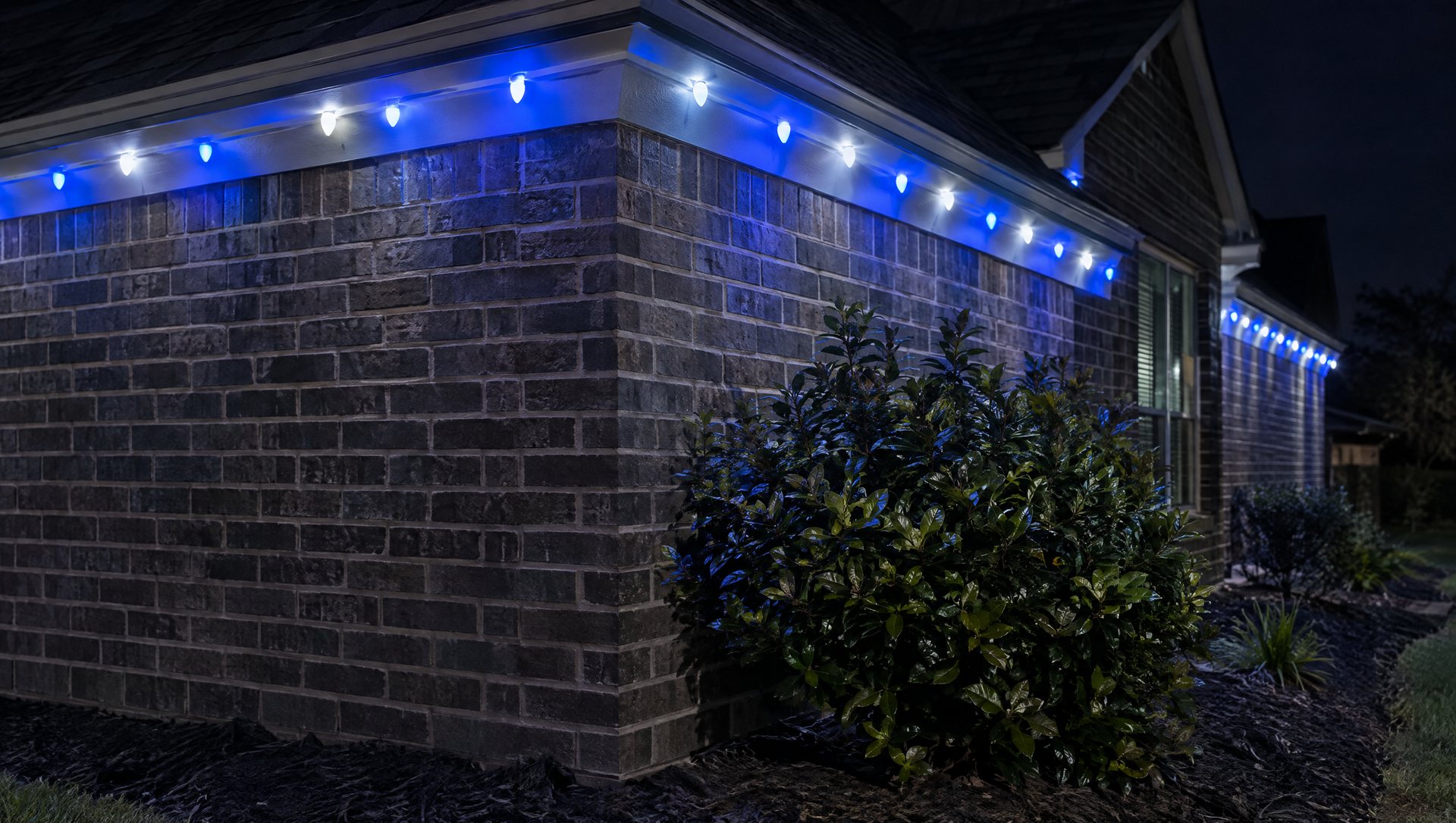
A worked example. A one-story ranch with 96 feet of front eave, bulbs at 12-inch spacing, which is a common C9 spacing on rooflines. A bulb at each end and one every foot between them means 97 sockets.
- One-and-one pattern (B-W-B-W): with 97 sockets, start and end on white and you get 49 white and 48 blue, with white at both corners. With an even count, one corner ends blue and the other white, and from the street the house looks lopsided. Adjust the spacing slightly, or trim one socket, to get an odd count.
- Two-and-two pattern (BB-WW): on a long, plain eave, pairs read as a bolder stripe. Here you want the count to land on a complete pair at each end. Plan it on paper first.
- Gables: work from the peak down. Put the same color at the peak and mirror the pattern down both sides, or the two slopes won’t match.
- Corners and run ends: decide what color turns each corner before you start, and keep it the same at every corner. Leftover bulbs at the end of a run are what make an alternating roofline look improvised.
For power, 97 LED C9 bulbs at about 0.6 watt each come to roughly 58 watts, well within a single outlet. For how C9 sizes, spacing and socket wire work, see our C9 Christmas lights guide.
Why blue takes over after dark
Equal numbers of blue and white bulbs don’t give equal visual weight. Bulb output, lens, spacing, viewing distance and the wall behind all change what stands out.
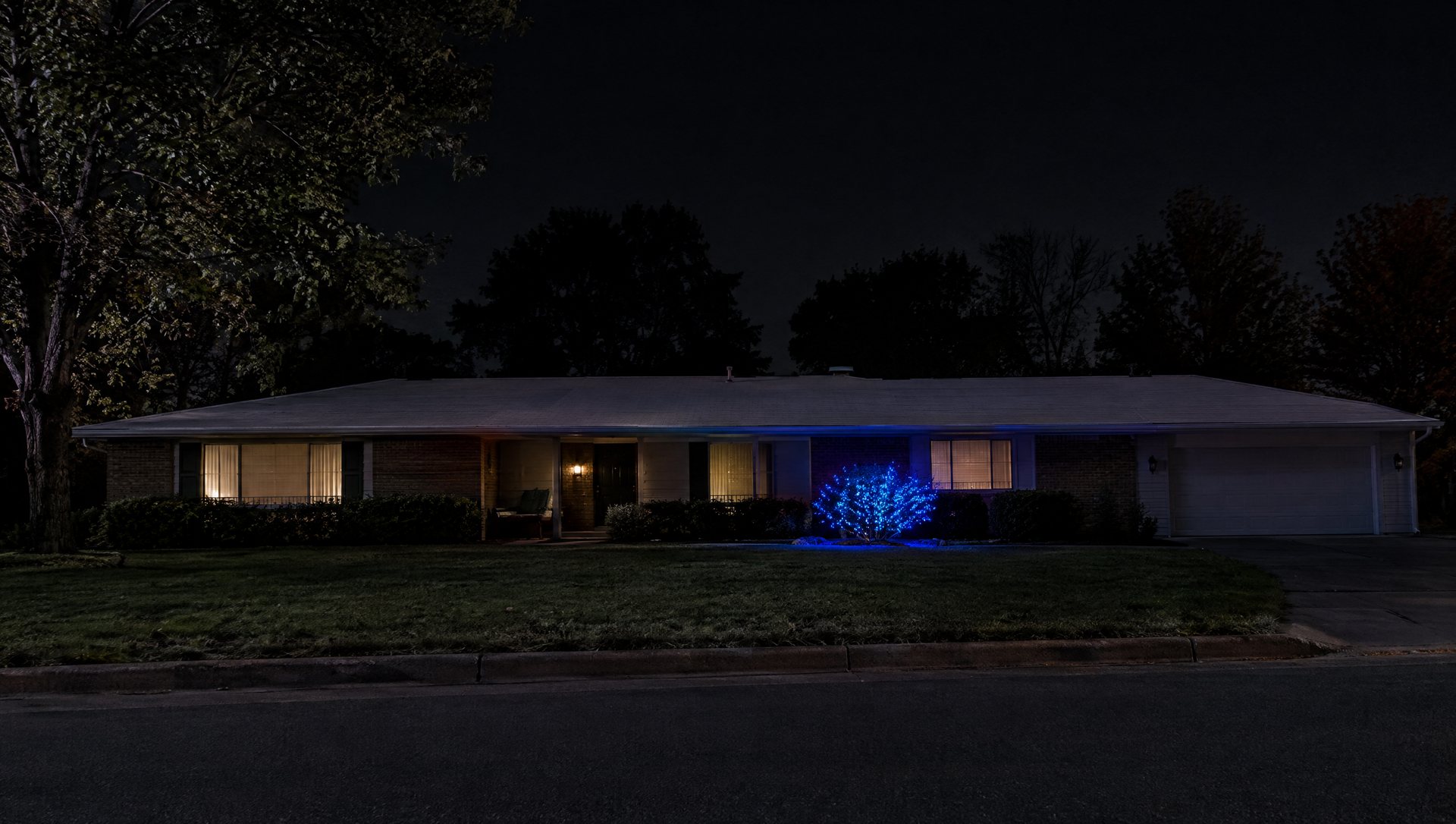
Your own eyes add a twist. As light fades, human vision shifts toward the blue end of the spectrum, a well-documented change known as the Purkinje effect. A blue tree that looked balanced against the white roofline at dusk can dominate the house once it’s fully dark and your eyes have adjusted. That’s why the balance check happens after full dark, from where people actually see the house: the street, the sidewalk across the way, the car.
If blue is winning when you don’t want it to, take some away. Reduce the area it covers, wrap the tree a little looser, or move blue off one element. Don’t respond by adding more white everywhere; you’ll end up with a brighter house that still looks blue.
And if blue is meant to be the star, as with one blue live oak in the front yard, let it. A small, intense blue feature can comfortably hold its own against a long white roofline.
Mix bulb sizes, not effects
Two colors don’t have to be boring. Get variety from texture instead of from extra effects:
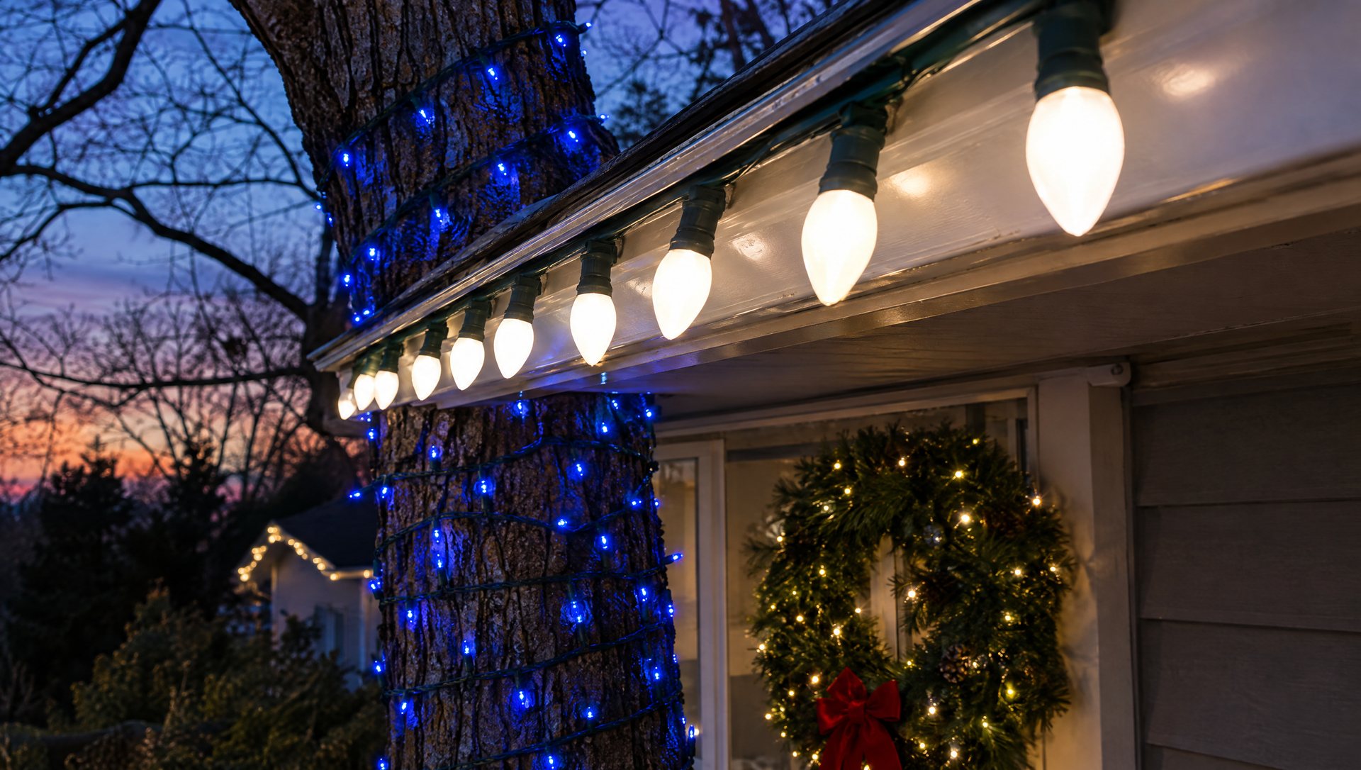
- Big C9 bulbs on the roofline draw a crisp line.
- Small 5mm or mini lights on trees and shrubs describe a surface.
- A lit wreath or garland at the door adds a round shape and greenery.
A simple house might need only a roofline and one tree. A deep porch can take a third texture at the door. What it doesn’t need is a blue tree that also has white flashers, color-changing bulbs, hanging ornaments and a projected snowfall pattern across the wall. Keep everything steady, or let exactly one element move. For porch ideas that fit a two-color scheme, see our front porch lighting guide.
The daytime look counts too
From Thanksgiving to mid-January, your display spends more hours in daylight than lit. Blue bulbs and white wire can be very visible against green shrubs or dark trim in the afternoon.
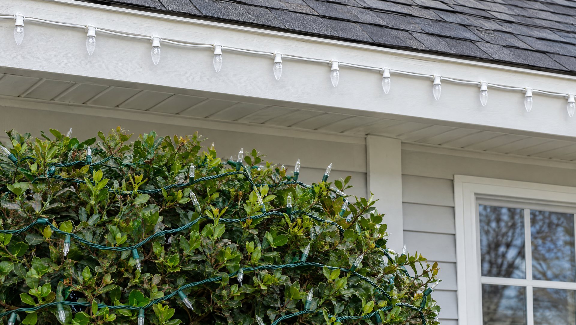
- Match wire color to the surface. Green wire in trees and greenery; white or brown wire on trim, depending on the paint.
- Keep runs tidy. Loops of extra cord on a gable become the daytime feature.
- Hide the connections. Tuck plug connections behind shrubs and off the ground, which also keeps them out of the sprinklers.
Look at the unlit display once from the curb on a sunny afternoon before you call it finished.
Blue and white for Hanukkah, or for both
The palette suits a Christmas display, a general winter look or a Hanukkah display. The colors alone don’t make it any of those. What makes a display read as Hanukkah is the imagery, a lit menorah or a Star of David, not the blue and white. Hanukkah in 2026 begins at sundown on Friday, December 4, and ends on Saturday, December 12, according to Chabad.org.
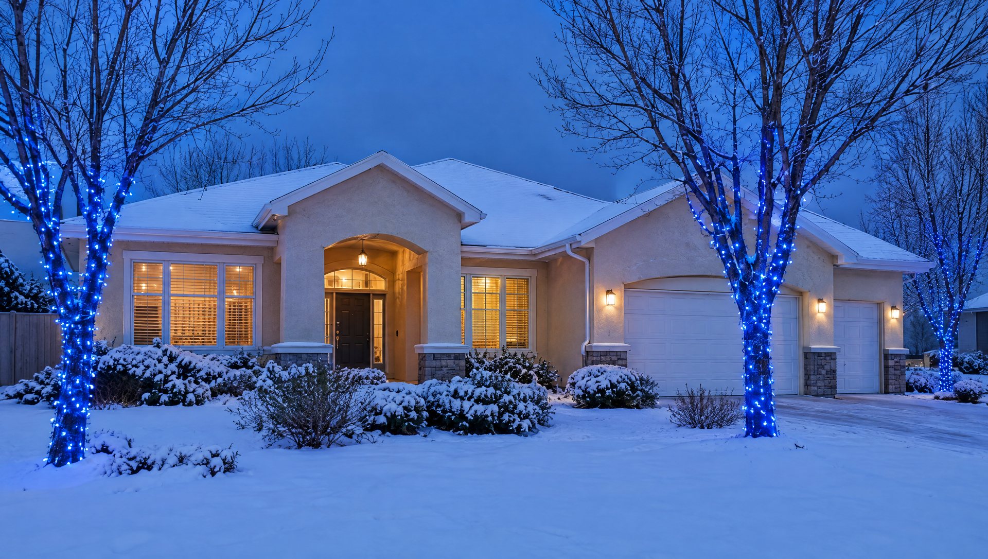
For a household that celebrates both, give each holiday its own area of the yard and let the shared blue and white tie them together. Our Hanukkah 2026 post has ideas for a blue-and-white outdoor display for the eight nights.
Build a test corner before you order
This is the step that saves the most money. Before you order the full run, set up the proposed colors together in one spot you can reach from the ground:
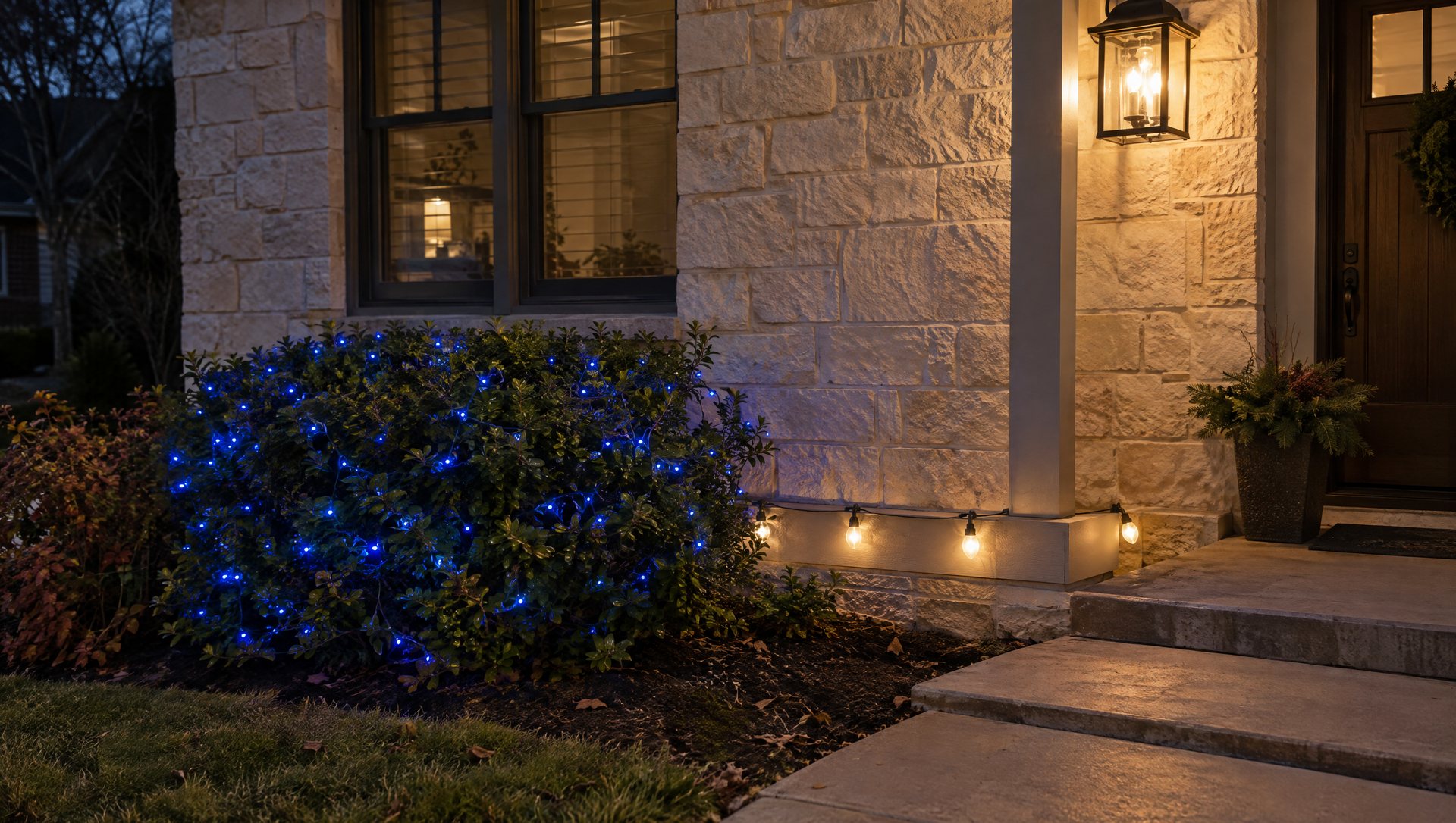
- A short length of the roofline bulbs, ideally in your planned pattern, clipped to low trim or laid along a hedge.
- A sample of the tree or shrub lights on a nearby plant.
- The wreath or porch light that will sit next to them, switched on.
- A piece of the real background behind it all: brick, stone or painted wall.
Look at it after full dark, close up and from the curb. Take a photo if you like, but trust your eyes over the phone; cameras push blue and white balance around. Then look again an hour later.
Write down the exact product line and color name of what you approved. “The blue ones” is not enough when you need twelve more next year and two similar boxes look different on the house.
Sapien uses commercial-grade C9 LEDs for custom rooflines and 5mm wide-angle lights for tree wraps. If you